Aug 7, 2026
Color Theory in Photography: How to Choose Palettes That Make Stock Photos Sell
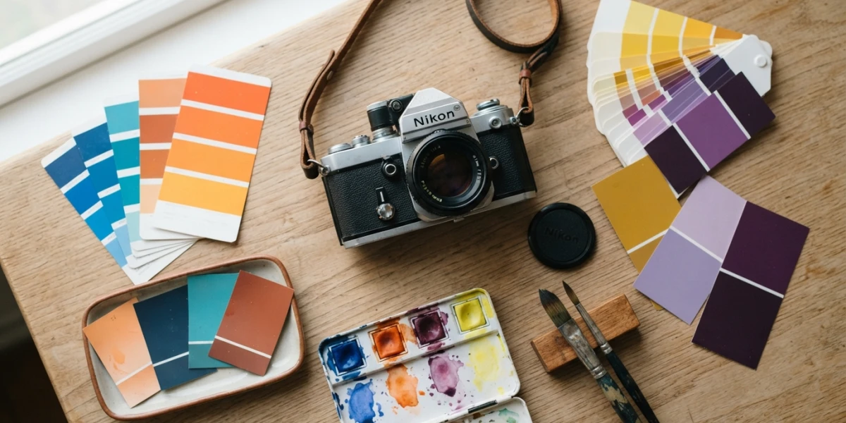
Image generated with AI
Before a buyer sees your subject, they have already reacted to your palette. Color theory in photography decides the first impression — calm or urgent, premium or playful — and that impression is what makes a designer download your image or scroll past it. Here is how to choose color on purpose.
Why Color Theory in Photography Decides Before the Subject Does
Vision is fast and color is faster. In the first instants of looking at a photograph, the brain processes the overall palette before it fully identifies what the picture contains. That is why a deliberate use of color can carry an image that would otherwise go unnoticed, while an accidental palette can sink a technically perfect shot.
Soft pastel tones communicate lightness, airiness and romance. Strong, high-contrast combinations generate drama and tension. Muted earth tones feel grounded and dependable. The palette works together with the expectations the viewer already brings: a warm golden frame feels inviting, a cold blue one reads as distant or melancholic. When palette and subject tell the same story, the image lands in a single glance; when they fight each other, the buyer hesitates and scrolls past.
Color Psychology vs. Color Theory
The two disciplines are often confused, but they answer different questions. Color theory teaches which colors combine well — the harmonies that look balanced and intentional. Color psychology explains why certain colors make people feel something: blue reads as trust and calm, red as energy and urgency, green as nature and health, yellow as optimism and warmth.
Working with both is what separates a lucky palette from a planned one. Theory gives you the structure; psychology tells you what mood that structure will trigger in a designer who is skimming hundreds of thumbnails. You do not need to memorize every rule — you need a repeatable way to make decisions before you press the shutter.
The Three Harmonies That Sell
Most successful stock images rely on one of three classic harmonies. Complementary colors sit opposite each other on the wheel, and the contrast makes the subject jump out of the background — the go-to choice for product photography where the object must dominate the frame. Analogous colors sit next to each other, producing calm, cohesive scenes that feel natural and unforced, ideal for lifestyle and brand imagery. Triadic harmony uses three colors equally spaced around the wheel, creating a vibrant, dynamic look that works well for campaigns that need to stop the scroll.
Monochromatic for Premium Simplicity
A fourth option deserves more attention from stock shooters: monochromatic palettes, built from a single hue family with variations in lightness and saturation. This is the look behind most premium product and editorial photography — minimal, elegant, and instantly expensive. It is also the easiest harmony to keep consistent across a series, because every frame already shares the same color DNA.
Warm Advances, Cool Recedes
One of the most useful practical tools in color is the way temperature shapes depth. Warm colors appear to advance toward the viewer, while cool colors recede into the background. You can use this to separate a subject from its surroundings without any compositing: a warm accent placed over a cool scene pulls the eye exactly where you want it. The technique works in product shots, where a single warm highlight sells the material of an object, and in portraits, where a warm key light lifts the face away from a blue-toned background.
Choose the Palette Before You Shoot
The palette should be a decision made during planning, not a rescue attempted in editing. Before the scene is built, choose two or three colors and align everything with them: props, wardrobe, background, and surfaces. A practical example: a cosmetic product with a mint-green package works beautifully with a complementary coral accent — a small coral cloth, a few coral-toned petals, a subtle blush of coral in the reflection. Keep every prop inside that family, and the frame feels designed rather than assembled.
White balance is also a color decision, not an automatic fix. Correcting every frame to neutral gray will quietly kill the mood you planned: a deliberately warm white balance is what makes a cozy interior read as cozy. Shoot with the series in mind as well. A set of ten images that share the same palette is worth far more to a buyer than ten unrelated singles, because a coherent set can be used as a complete campaign.
From Capture to Grade
In post-production, the goal is to refine the harmony you planned, not impose one the scene never had. Local and global HSL adjustments let you pull the colors gently toward the palette without breaking the natural look — nudging a green toward the mint you designed, softening a red that drifted into orange. Avoid the temptation of a global saturation boost; it breaks cohesion and makes every color shout at once.
Consistency matters more than perfection in any single frame. When the colors across a series line up, buyers can use your images interchangeably in one layout, and that usability is exactly what makes a collection feel professional.
What Buyers Look For
From the buying side, designers are not looking for technically correct color — they are looking for palettes that fit a brand identity and the mood of the moment. Trend cycles matter: bold, saturated looks and muted earth tones trade places by season, and a palette that matches the current visual language gets used more often.
An intentional palette also communicates the tone of a campaign before a single word of copy is read. That is why collections organized around a coherent color story — like the ones on YourPhotoStock — are so practical for designers: instead of hunting through thousands of random images, they can browse a set that already matches the identity they need to build.
Conclusion
Color is the first thing a buyer feels and the last thing they can name. Choose a harmony on purpose, let warm and cool tones do the separation work, plan the palette before the shoot, and keep it consistent through the grade. If you are buying, browse with your brand palette in mind and let the color story do the filtering for you; if you are selling, plan your next session around a concrete harmony and shoot a series that a designer can use as a campaign. Explore the YourPhotoStock collection and see how much a deliberate palette changes what you notice first.
Related articles


Looking for the perfect stock photo?
Browse thousands of premium photos and 4K videos, pay per download.
Browse the collection