Aug 2, 2026
Color Grading for Stock Photos: Why Restraint Gets Accepted
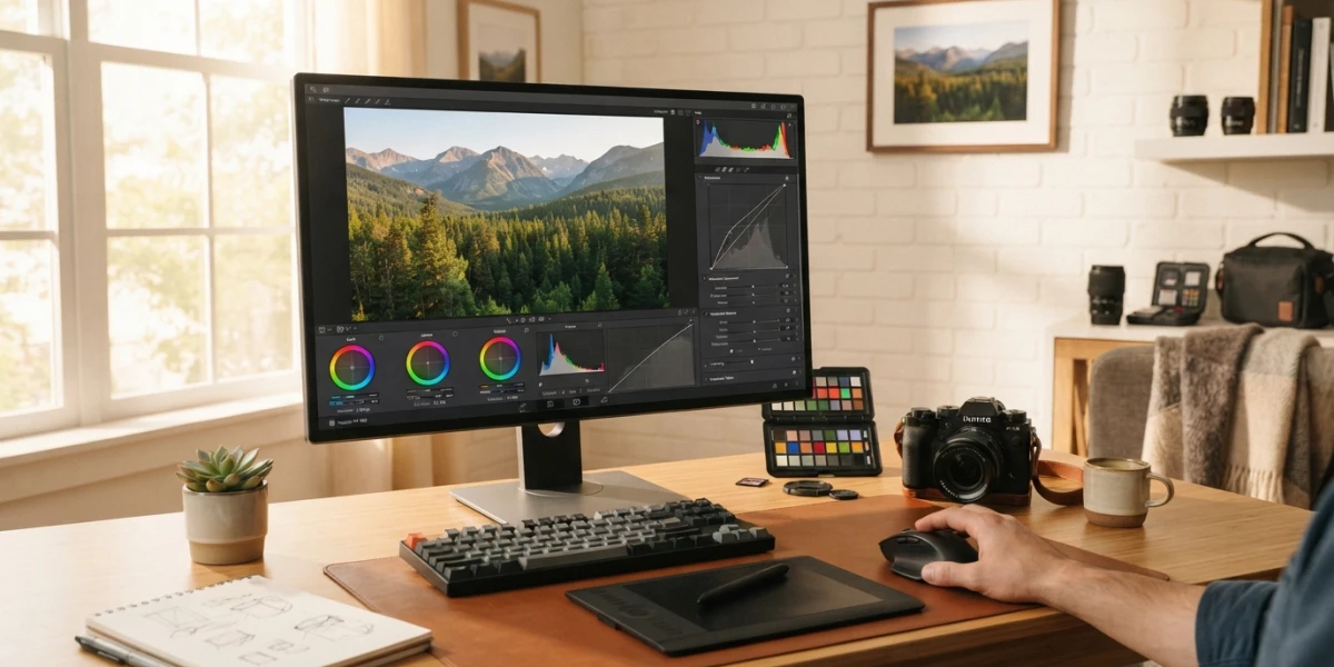
Image generated with AI
Color grading for stock photos fails most often when it shouts. A careless grade — tinted whites, orange skin tones, saturation pushed to the limit — sits behind a surprising share of platform rejections, and it is almost never the bold look that gets flagged. The fix is not a fancier style. It is a four-step, correction-first workflow that reviewers accept again and again.
Color Correction Comes First
Before any style is applied, the image has to be technically neutral. Color correction and color grading are two different stages, and mixing them up is the most common beginner mistake. Correction is the repair work: fixing white balance, exposure, and skin tones so the file records what the scene actually looked like. Grading is the creative layer on top: a warm teal shadow, a faded film look, a moody low-key palette. The working rule is simple — correction first, style second. When the correction is not neutral, the grade has nothing solid to sit on, and the result shows it: skin goes muddy, whites go blue, and the whole frame reads as processed.
The Rejection Trap: Overprocessed and Oversaturated
Platform reviewers are trained to flag images that look overprocessed. Adobe's contributor forums are full of photographers asking why a technically sharp photo was rejected, and the recurring answer is a short list of color-related faults: too much saturation, oversharpening, clipped highlights, and unwanted flares. The word that appears most is "overprocessed" — the image no longer looks like a photograph, it looks like a filter.
The commercial reason matters more than the technical one. A stock library is a catalog that designers browse at thumbnail size. An oversaturated image does not read as "creative" at that scale; it reads as fake, and a professional editor will not put a fake-looking image in front of a client. When an editor has to choose between a neutral photo and a saturated one for a campaign, the neutral one wins almost every time, because it fits any brand palette without fighting it.
What Reviewers Actually Check
If you want to pre-check your own work before submitting, run through the same list the reviewers use:
- Neutral white balance — whites should be white, not blue or yellow.
- Natural skin tones — skin should look like skin, not orange or magenta.
- No clipping — detail preserved in both highlights and shadows.
- No halos — no light edges left behind by sharpening or local adjustments.
- Controlled noise — luminance noise is acceptable at high ISO; chrominance noise, the colored speckles, is a rejection trigger.
A Restrained Grading Workflow (4 Steps)
The workflow below is the one that gets photos accepted and, more importantly, bought. It works in Lightroom, Capture One, or any editor with basic color tools.
Step 1 — white balance. Use the eyedropper on a neutral area, or shoot with a gray card when the light is mixed. This single step removes the tint behind most "off color" rejections.
Step 2 — exposure and base curve. Set exposure so the histogram sits inside the edges. Pull highlights and shadows just enough to protect detail; do not compress the curve so hard that the image turns flat and hazy.
Step 3 — HSL for skin and greens. These two colors betray an amateur grade faster than any other. Warm and desaturate the orange channel slightly when skin looks waxy, and calm the greens when foliage turns neon. Small slider moves — five to ten points — are usually enough.
Step 4 — subtle grading. Split toning or the calibration panel, kept gentle: plus ten to fifteen points of global saturation at most. If the image still looks flat after a restrained grade, the problem is usually the correction, not a lack of style.
Matching a Series
Buyers rarely download a single image; they build collections. A series that looks like it was shot by the same person, under the same light, is worth more than three disconnected singles. Save a preset after the first image is corrected, set the same target temperature for the session, and sync the settings across the batch. Consistency raises your acceptance rate and, more importantly, builds the trust that makes a designer come back to your portfolio.
Grade for the Buyer's Screen
Your grade only matters if it survives the trip to the buyer. Export in sRGB, the color space every browser and screen assumes. Then do the review most photographers skip: look at the thumbnail. At two hundred pixels wide, oversaturation screams and a muddy grade turns invisible. If the image does not look clean and bright at thumbnail size, fix it before uploading.
Brightness deserves special attention. Search results are dominated by bright, airy images; a dark, moody photo gets lost in the grid even when it is technically beautiful. Keep the midtones up and the exposure honest, and the image will perform in search before a single word of the title is read.
The Commercial Mindset
The final step is not in the editor, it is in your head. Every image you submit should answer a commercial question: would a designer use this in a campaign, a website hero, or a product launch? Photographers who sell consistently stop asking "is this my favorite shot?" and start asking "does this solve a buyer's problem?"
Natural color is part of that answer. A restrained grade works with any brand palette, any layout, any client. That is why the YourPhotoStock collection is built on real photography with natural editing — images chosen to be useful, not just striking, and every file carries a commercial license for exactly that purpose.
Conclusion
Color grading for stock photos is not about being bold; it is about being clean. Correct the image first, grade with restraint, and always check the thumbnail before you submit. Do that consistently and rejections stop being a mystery — and downloads start being a habit. Explore the YourPhotoStock collection to see how natural, commercially-minded color looks in practice.
Related articles



Looking for the perfect stock photo?
Browse thousands of premium photos and 4K videos, pay per download.
Browse the collection